
There are, the saying goes, three kinds of lies: lies, damned lies, and statistics.
We tend to think about that axiom in the context of politics, where people willfully manipulate numbers to suit their beliefs and goals. But statistical analyses in any context are only as perfect as the people who perform them—which is to say that none of them are.
The predictive scores, algorithms, and other mathematical tools that advancement and alumni teams are increasingly using to evaluate alumni engagement and likelihood to make a gift often obscure reality and, as a result, counterproductively warp our priorities and strategies.
Every engagement or affinity score, or algorithm, or survey result is one or more steps removed from reality. What happens to these numbers in the intervening steps is what makes them powerful, but it is also what should make us wary. Here’s why.
FUZZY MATH
We add, multiply, and divide variables with algorithms or to generate scores because we intend the product to be more predictive of future behavior or more reflective current attitudes than the numbers we start with.
The problem is, this process isn’t a science; it’s an art that we can easily get wrong. And when we devise strategies for solicitation or engagement that center on flawed scores, those strategies are flawed too.
Here are a few real-world examples from three different institutions.
1) Alumni are rated on a 14-point scale. All worth one point: Holding season athletics tickets, being a member of the online alumni community, meeting face-to-face with an officer, volunteering, having an email address on file, having a job title and employer on file, attending an event, or attending a reunion. Giving this fiscal year is worth four points, having given last year is worth three points, and an increasing in giving between the two is worth one point.
This scale is a couple things: flat, in that it doesn’t have enough range to recognize the full depth of affinity and engagement; and poorly weighted, in that it does not assign the correct relative significance to different activities.
Why is a face-to-face meeting with an officer rated the same as having an up-to-date email address? Is signing up for an online platform really as indicative of engagement as attending a reunion? What if they fly from the other side of the country—or the globe—to attend? What about the size of a gift? The math at play here does not accurately represent the degree to which alumni are engaged with and loyal to their alma mater. It is easy to generate and easy to read, but what use is an easy score if that score is inaccurate? The point behind a score is not just to simplify a complex array of variables, but to maintain some of their original nuance and reveal to us things we didn’t already know.
The institution that uses this scale has mandated that relevant offices be judged on their performance in boosting these scores. This approach can incentivize some behavior that boosts numbers in the short term but does little to change things in the long term. Pushing alumni to give might make their score go up a whopping four points but do little to help—and perhaps even actually harm—their affinity for the institution if it is not grounded in a deeper, two-way relationship.
2) Alumni are rated according to 19 different activities, from opening an email to engaging on social media to making a recurring gift, each of which is weighted according to their importance and the effort they require. There is no maximum score. The average score is 27; the most engaged alumnus has a score of over 400.
This is a much broader, deeper, more accurate way to measure engagement than the shallow 14-point scale of the previous example. It encompasses digital behaviors, like engaging on Facebook and opening email, as well as traditional ones, like attending reunions. The wide range of scores, from low double digits into the hundreds, captures the passion some alumni have for their relationship with their alma mater.
This more holistic approach to scoring engagement produces a more subjective score—how much more engaged is an alumnus with a score of 75 than a score of 100? Is someone with a score of 400 four times more engaged than someone with a score of 100? (And what does it even mean to be four times more engaged than someone else?) But this subjectivity is a strength because it reminds us that the score is not the be-all-end-all of measuring engagement. To critique it further we’d need to know how behaviors are weighted, which behaviors are and aren’t counted, and how the score informs the strategy of the alumni and advancement teams.
3) Alumni respond to 15 questions about their relationship with their alma mater with “strongly disagree,” “disagree,” “slightly disagree,” “slightly agree,” “agree,” or “strongly agree.” (A six-point Likert Scale.) Each alumna is assigned a score between 15 and 90 points based on the sum of those answers—“strongly disagree” is worth one point and “strongly agree” is worth five.
Surveys are an important and powerful tool for measuring alumni sentiment. Despite the critique that I’m about to offer, it’s important to remember that nothing is better than going straight to alumni and asking them what they think and what they need. But that doesn’t make this particular approach perfect.
The Likert Scale itself is imperfect. First off, most Likert Scales have an odd number of questions and have a "neither agree or disagree" option in the middle; using an even number of questions forces alumni to agree or disagree when they might feel neutral. Second, assigning numerical values to feelings is difficult. Is someone who "strongly agrees" with someone six times more positive about it than someone who "strongly disagrees" with it? Shouldn't we assign disagreement negative values? And so on.
Relationships and loyalty aren’t numbers and can’t be treated as such. When we turn them into scores we assume that all the standard mathematical rules apply—that 100 is twice as much as 50, that 75 is greater than 70, and so on. But these scores don’t behave like numbers—they’re just ratings we arbitrarily assign.
THE BIGGER THE MAP, THE HARDER IT IS TO MANAGE
No score or algorithm is omniscient—can’t fit everything into an equation. Whether you use 14 data points or 1400, you can’t take the reality of human relationships, loyalty, and love, in all their complexity, and turn it into a game of math.
I like this excerpt from Lewis Carroll's novel, Sylvie and Bruno, as a way to demonstrate this point. (Borges expanded on the concept in his better-known short story “On Exactitude in Science.”)
"What a useful thing a pocket-map is!" I remarked.
"That's another thing we've learned from your Nation," said Mein Herr, "map-making. But we've carried it much further than you. What do you consider the largest map that would be really useful?"
"About six inches to the mile."
"Only six inches!" exclaimed Mein Herr. "We very soon got to six yards to the mile. Then we tried a hundred yards to the mile. And then came the grandest idea of all! We actually made a map of the country, on the scale of a mile to the mile!"
"Have you used it much?" I enquired.
"It has never been spread out, yet," said Mein Herr: "the farmers objected: they said it would cover the whole country, and shut out the sunlight! So we now use the country itself, as its own map, and I assure you it does nearly as well."
The bigger your map gets—the more variables your score or algorithm includes—the more difficult it is to manage. Soon, managing your map becomes just as time consuming as managing the territory. And the more variables we have, the more likely we are to encounter the aforementioned problem of fuzzy math—how do we weight them all?
Now, I admit that automated data collection (for example, through social media APIs) and predictive analytics are making strides toward solving this problem and will continue to do so. They make managing hundreds or thousands of variables possible, and machine learning can even help us weight those variables and understand how they affect likelihood of giving and engagement overall.
But using past behavior to predict future behavior strictly limits us to extracting engagement from our constituents rather than cultivating it. They tell us how engaged someone is but not how to make them more engaged. And that’s where we get to my third point.
THEY MIX UP CORRELATION AND CAUSATION
Once we get engagement scores for our alumni, our first impulse is often to try to improve those scores. Raising the score will increase engagement! Home run!
Well, not quite.
It’s helpful to think about engagement scores like SAT scores—all an SAT score does is measure how good you are at the SAT. Taking an SAT class to do better doesn’t make you more intelligent. It doesn’t make you a better college student. It just makes you better at taking the test.
In the same way, boosting an alumna’s engagement score doesn’t necessarily make her more engaged. Take example #1 from above, where when an alumna gives during the current fiscal year her score goes up 4 out of 14 possible points. That’s a huge increase. But does making that gift make her more engaged? No. It might represent that she is more engaged, it might correlate with higher engagement. But the act of giving does not cause her to be more deeply engaged, and so hounding her for a gift does not qualify as an attempt to engage her more deeply. In the same scoring scheme, we’d assume that an alumna is more engaged because she met with an advancement officer, even though we all know some meetings are duds and others go the wrong way entirely. We haven’t made any progress, we just made the numbers go up.
When we get our hands on an engagement score, we do a little happy dance because we think we have the holy grail of our profession—boost the score, boost engagement. But it doesn’t work that way. All we know for sure is that boosting the engagement score boosts the engagement score. That’s it.
Let’s use another metaphor to help illustrate this sometimes counterintuitive point.
Let’s say we have two cups—or beakers, if you prefer—a big one and a little one. As we pour water into the larger cup, it reaches its lip and starts to pour down into the smaller one beside it. This represents the affinity threshold, let’s call it, that an alumna must reach before she engages in a particular way—attends an event, makes a gift, etc. The water, representing her affinity for her alma mater here, must reach a certain level before it pours into the next cup, i.e. before she attends an event.

In reality, we can’t really tell exactly how much affinity any given alumna feels toward her alma mater like we can tell how much water there is in a measuring cup, so let’s put the first cup behind a screen.
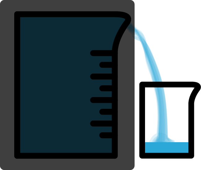
That’s a more accurate representation of the situation in which we find ourselves when it comes to measuring alumni engagement. We don’t know exactly how engaged someone is because we can’t look inside their heads and hearts and read their minds. Instead we look to their behavior to judge the degree to which they are engaged. When the water starts to pour into the second cup—when they give or attend an event or do something else—we know the water—their affinity—has reached the threshold.
They key point here is that what we’re actually interested in is the water level in that first cup. What we want to measure is their affinity for their alma mater. But we can’t see through that opaque screen so we tend to focus our efforts on getting water to pour into the second cup, to focus on getting alumni to participate in a given way. We are mixing up the result (water in the second cup, i.e. participation) with the cause (reaching the threshold in the first cup, i.e. feeling a certain degree of affinity).
So what do we do then? We game the system to lower the affinity threshold so that alumni don’t have to feel as much affinity as before to engage in a particular behavior. Then it looks like more alumni are more engaged when all we’ve done is changed the parameters of the situation. Rather than increasing their affinity—increasing the water level—we’ve just lowered the threshold. It’s like filling the first cup up with sand.
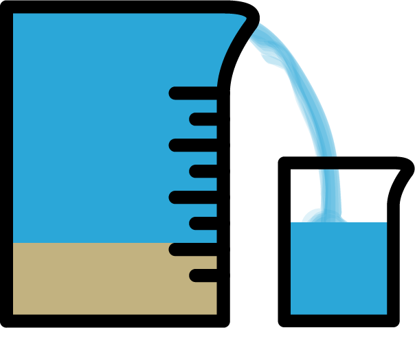
There isn’t any more water in the cup. There isn’t any more affinity. It just looks like there is because we’ve lowered the threshold for engagement. Some real world equivalents of putting sand in the cup include boosting Facebook posts, lowering the cost of event attendance, or doubling down on fundraising emails. There is nothing wrong with these practices, but we need to recognize that just because they increase the number of likes, attendees, and gifts we get does not mean that they are boosting affinity and engagement. What they are doing is lowering the threshold for engagement so that people who feel less affinity for their alma mater participate in some way. In the long term, getting someone to attend an event that they wouldn’t have otherwise may be a way to get them more involved with their alma mater. But earning likes, gifts, or attendance is not the direct route to higher institutional affinity that engagement scores suggest it is.
Engagement scores encourage us to engage in this sort of manipulation. We become so focused on alumni behaviors that we lose sight of what inspires people to do those things in the first place.
“ESSENTIALLY, ALL MODELS ARE WRONG, BUT SOME ARE USEFUL.”
Should we throw out all engagement scores and algorithms? No—baby, bathwater, etc. But we should be wary of the way these tools warp how we see the world and check in every now and then to make sure that the conclusions they lead us to are in line with what is actually happening. When the map becomes the territory, how can we even know we’re lost?