
With some design help from MetaLab, the company that designed Slack, the Switchboard dev team has been hard at work build our shiny new analytics dashboard and member directory.
The new dashboard makes it easier than ever to measure your community's activity and put Switchboard to work for your office's other initiatives.

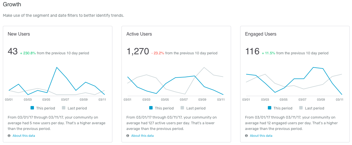

The new dashboard and directory let you create and share member segments—users who have posted more than three times, for example, or graduates of the last decade—and then track user activity for each individual segment. Nice!

No more mucking around in spreadsheets and creating graphs yourself. Our new dashboard has a direct export-to-PDF option that lets you easily share reports with your colleagues.
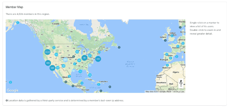
Our partner schools are also excited about the member map, which lets you find your users, wherever they are. Zoom in on a city and click to view a list of your alumni in the area.
The birds-eye view is important, but so are the nuts and bolts of your Switchboard. The new dashboard makes it possible to find your most active users so you can identify volunteers, mentors, and giving prospects. It also makes it easy to measure the performance of recent posts so you can keep track of your community's needs as they change month to month.

This is only a small sample of what Switchboard's updated dashboard and directory can do. Interested in learning more? Email me at kieran@switchboardhq.com and we can find time for a quick demo.